Form Design
Designer Introduction
The form designer is divided into three sections: left, middle, and right layout:
- Left: Available fields (components) area. Fields can be added to the design area in the middle by dragging and dropping. The left fields are divided into three categories:
- Basic fields: Basic form component elements
- Advanced fields: System-customized advanced components related to documents, organization users, categories, etc.
- Layout fields: Used for form layout to divide a row of the form into multiple layout areas
- Middle: Form design area. The design area uses a what-you-see-is-what-you-get approach. You can adjust the layout of existing fields by dragging and dropping, and you can also copy, delete, and other operations on fields. After clicking to select a field, the properties of that field will be displayed on the right.
- Right: Properties area, divided into field properties and form properties
- Field properties: After selecting a field in the design area, the field properties are displayed on the right. You can directly modify property values, and the design area will respond to changes in real time
- Form properties: Overall properties of the form, as well as version information of the form
Grid Layout
The designer uses a 24-grid layout system, dividing the entire design recommendation area into 24 equal parts. The information blocks after division are called "boxes". It is recommended that the number of horizontally arranged boxes is at most four and at least one. The design part customizes the typography rules inside the box based on the unit of the box to ensure visual comfort.
For detailed introduction to the grid system, please refer to: Grid System
Form Properties
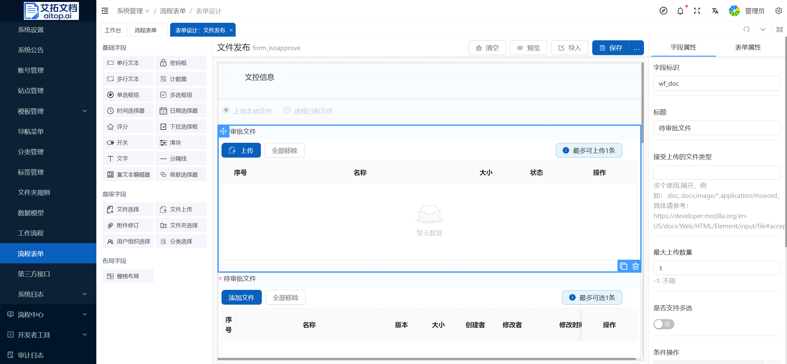
- Form name: Forms are deeply associated with processes, so it is recommended to use the naming format of "process name" + "form", for example: File Publication Form
- Form ID: Form IDs in the system must be unique. It is recommended to use the naming format of "form_" + "process ID", for example: form_approve
- Form layout:
- Horizontal arrangement: Text labels and components in fields will be arranged horizontally
- Vertical arrangement: Text labels and components in fields will be arranged vertically
- Inline: The width of the field uses the default width and will not adaptively occupy the entire row
- Label alignment: The alignment of text in text labels, only effective when the form layout is "Horizontal arrangement"
- Label layout: Fill in a number from 1 to 24, representing the number of grids occupied. For example, if the width is 24, the label width occupies the entire row (one row is 24 grids). At this time, even if the form layout is set to horizontal arrangement, the text labels and components will each occupy a row.
- Component size: The height size of the component. It is recommended to use the default value
- Hide required mark: By default, if the operation property of a field is set to required, a red asterisk will be displayed on the left side of the label. It is recommended to use the default settings
Field Properties
Different field types may have different field properties.
Common Properties
- Field identifier: Associates properties defined in the data model. The value of the field will be saved in the selected property
- Title: Content displayed by the text label in the field
- Width: Component width in the field. You can fill in a percentage or a specific px value, for example: 100%, 200px
- Placeholder content: Placeholder text displayed when the field has no input content. Generally, it is an input prompt
- Default value: The default value given to the field when the form is initialized and created
- Operation properties: Set required, read-only, disabled, and other properties of the field
Advanced Properties
- Conditional display: You can specify a Javascript script function. When the function returns true: display the field; when the function returns false: do not display the field; leave blank to always display. In the function, you can use formData to get the values of other fields in the form; in addition to the field variables defined in the form, you can also use the following default variables:
- formData.taskName: When the process is under approval (non-start or end status), you can know the current process progress through taskName
- taskName values: Not submitted (undefined), Under approval (task name in the flowchart), Approval completed (completed)
- formData.myTask: Whether the current user is a task handler (true: yes; false: no)
- formData.isStart: Whether neither draft saved nor application initiated (true: yes; false: no)
- formData.isDraft: Whether it is a draft (true: yes; false: no)
- formData.wf_status: Current process status (needs to be used with the execution listener or task listener of the process, changing the value of bpm_package.properties["idoc:wfstatus"] in the listener)
Description
When writing scripts for conditional display, conditional activation, event properties, etc., you can use the Insert Script function in the script editor to modify based on the default function.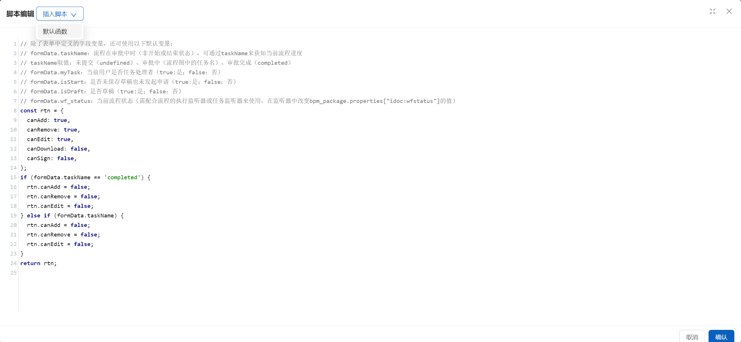
- Conditional activation: After submitting for approval, all form items will be disabled by default. You can specify a Javascript script function. This function returns true to activate the form item. In the function, you can use formData to get the values of other fields in the form; in addition to the field variables defined in the form, you can also use the preset default variables. For details, please refer to the "Conditional Display" section above
- Event properties:
- onChange: Event triggered when the value of the field changes. Common scenario: File selection field. When a file is selected, it is necessary to read file attributes and automatically fill them into the corresponding fields of the form.
- Read file attributes: getNodesInfo
- Receives two parameters: val (changed value, generally an array of nodeRef or uuid), json object (key is the property name to get, value is the default value)
- Return value: Return property values in jsonArray format. For example, to get the cm_name attribute value of the first file, you can use: res[0]['cm_name']
- Read file attributes: getNodesInfo
- onChange: Event triggered when the value of the field changes. Common scenario: File selection field. When a file is selected, it is necessary to read file attributes and automatically fill them into the corresponding fields of the form.